CASE STUDY
BRANDING, DESIGN, AND MARKETING FOR A SMALL BUSINESS EXPANSION
A smalltown lumberyard had a fledgling kitchen and bath department, but it was growing enough to consider building it into a stand-alone business. They needed help figuring out how to effectively differentiate it from the construction materials business, of which there was considerable crossover. I was brought in to help with the branding, graphic design needs, and marketing of both businesses.
IDENTIFYING THE PROBLEM
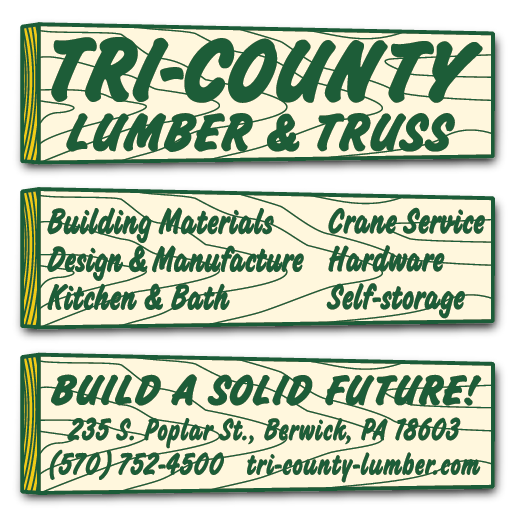
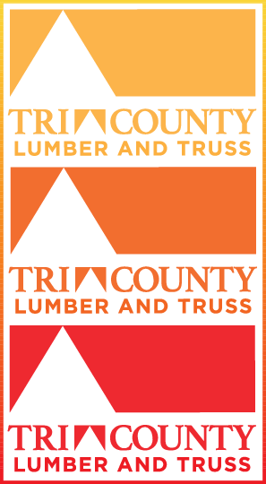
With the growth of their new kitchen and bath department, Tri-County Lumber had recently commissioned a new logo and marketing materials (right/below) from a local agency to broaden appeal to a new clientele. While rebranding was necessary, this new design was a too-stark departure from their previous, classic “retro” branding (left/above), and presented a contradiction: while trying to look more “upscale” to attract interior renovation customers, it offered a poor fit for the lumber and truss operations.
I liked the inside-out triangle in lieu of a hyphen and the suggestion of a roofline in the ad border. But the corporate-like form was inappropriate for the construction materials portion of the business. Moreover, the logo was difficult to use: the two colors were nearly indistinguishable, and its rigid landscape orientation lacked adaptability for a range of applications.
Nevertheless, I needed to work with this in the near term.

TRANSITIONAL DESIGNS

The lumberyard had a contract for print ads with the local newspaper, and they wanted to continue promoting construction materials while increasing visibility of the kitchen and bath department. I slightly edited and adapted the existing logo, making it monochromatic and exploiting the suggestion of a roofline into a major design element by isolating and enlarging it.
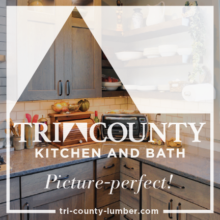
The kitchen and bath department was first introduced utilizing this same identifiable visual scheme and logo, just replacing “Lumber and Truss” with “Kitchen and Bath.” I reduced the copy to just the basic information to drive viewers to the website, where a pop-up window on the home page promoted the expansion of the kitchen and bath department.
Making the small ads stand out from the typical fare crowding the newspaper pages took some creative heft. This one succeeded in attracting attention, based on the increase in online searches after it was published. It was also a decent solution to the problem of the horizontal logo working in vertical ad space.
CREATIVE PLACEMENTS

I looked for value in advertising opportunities for the lumberyard, and found one in a plaque to be placed on ball washers at a local golf course, where many contractors played and socialized. Humor is nonexistent in local businesses’ ads, so this felt like a wild swing, but it was a hit.
The logo was now working better on larger, landscape-oriented ads. However, I was still finding it nearly impossible to use effectively on small or portrait-oriented ads, and had stepped up my search for solutions.
The logo was now working better on larger, landscape-oriented ads. However, I was still finding it nearly impossible to use effectively on small or portrait-oriented ads, and had stepped up my search for solutions.
COVID-19
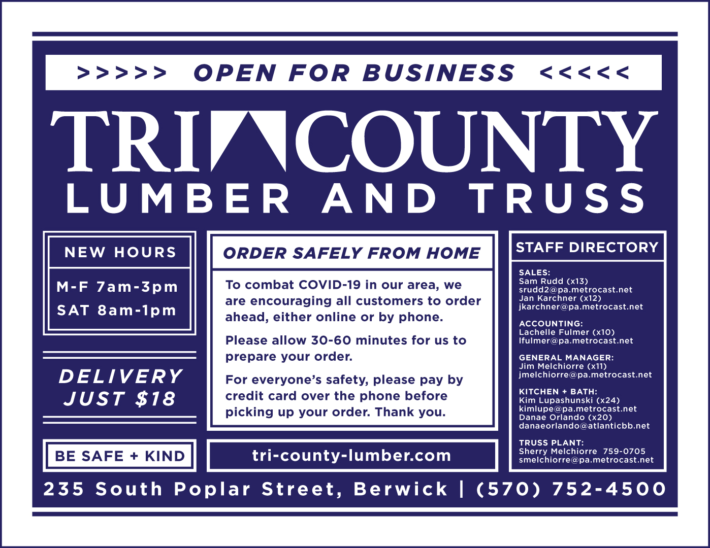
Everything was upended when the state went into lockdown for the COVID-19 pandemic. Construction was initially halted state-wide, but when the lumberyard was deemed an essential business, we alerted customers with a flyer and ad that we promoted heavily. I also used social media to keep people informed of rapidly changing state regulations and conditions and advocated on behalf of builders, whose anxiety was palpable.

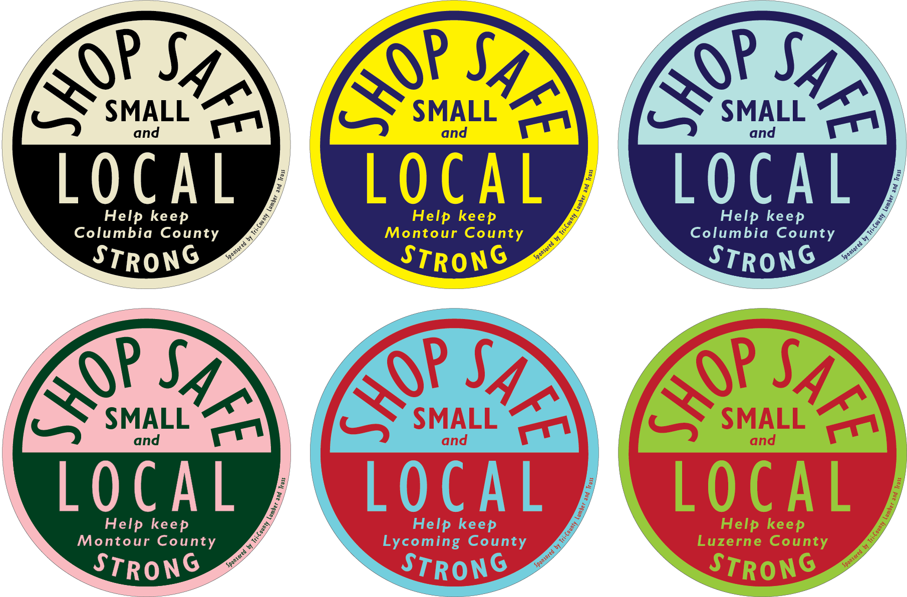
Also during the pandemic, I pitched the business an idea to promote local pride and good safety practices by sponsoring a decal to be distributed to area small businesses. I designed one for each of the area counties and it was eagerly picked up by the Chamber of Commerce and produced by the local newspaper, who also ran a nice story.
This is a tactic I used repeatedly with the business: be a regular, loyal advertiser in the newspaper, stay engaged with the community, and alert the newspaper to special promotions that were of broad interest to their readers. This resulted in a bevy of free advertising, including several front-page stories.
This is a tactic I used repeatedly with the business: be a regular, loyal advertiser in the newspaper, stay engaged with the community, and alert the newspaper to special promotions that were of broad interest to their readers. This resulted in a bevy of free advertising, including several front-page stories.

FOREST & FIELD
Construction was now underway for the new kitchen and bath showroom, which they decided to call “Forest & Field,” inspired by the surrounding rural landscape and the New England farmhouse aesthetic that was popular.
I went to work on the first effort of a logo during a trip to London where I researched signage extensively, documenting various pubs, bistros, and antique shops.
I chose a serif typeface that was appropriate for what would be a higher-end, independent business. The new business targeted more women and design professionals, rather than solely contractors and builders, but as it still carried siding, roofing, windows, and doors, it needed to achieve a crossover appeal.
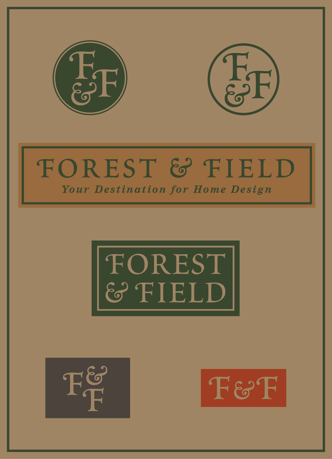
A hybrid visual identity worked — one that harkened to traditional design, with a humanist typeface set in all uppercase. I balanced that with a more decorative ampersand and edited the “F” with a similar flourish to complement it. The result was strong and elegant, not easy to characterize as masculine or feminine, but with elements of both.
Multiple versions emerged, including an abbreviated “F&F” supporting icon, and a stacked version that would become the entrance sign. The result was a highly adaptable identity, with logos for a wide variety of applications, from the smallest favicon to a wide banner headline.
EARNED MEDIA

At this point, we were securing newspaper coverage almost monthly, often for free, sometimes with a paid ad that the newspaper accompanied with a photo and story, like pictured here.
In fact, the entire construction process was documented by the newspaper, beginning even before a groundbreaking photo-op with local officials. It continued after opening with announcements of special events like cooking classes in the showroom’s working demo kitchen.
In fact, the entire construction process was documented by the newspaper, beginning even before a groundbreaking photo-op with local officials. It continued after opening with announcements of special events like cooking classes in the showroom’s working demo kitchen.
MAKING CONNECTIONS
We introduced the new branding for Forest & Field while making it clear it was an offshoot of the lumberyard in order to retain the trust that business had earned. I created ads to spark intrigue, build anticipation, and convey familiarity, while inviting people to follow on social media where I was conducting trivia contests with themes of architecture and design.

A REFRESHED LUMBERYARD

With business in the area finding some footing again, and building picking up rapidly, I resumed the redesign of the lumberyard logo by focusing on a compact, heavy, sans-serif typeface, a more appropriate image for the construction materials side of the business. Making the triangle red and blue gave it visual pop and appealed to the patriotic culture of the area. And the ampersand helped formally.

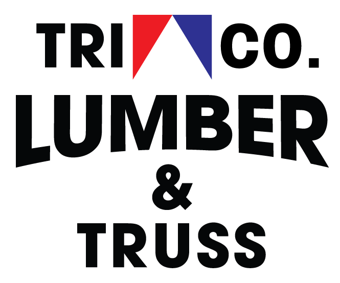
All the work I put into the new lumberyard logo hit its stride with an attractive, compact form that was bold and striking. It recalls old-school workers’ pride while retaining a modern, clean appearance and digital-friendly flexibility. It could work equally well on the side of a truck, back of a t-shirt, or social media banner. The red/blue triangle was now its trademark, and well-suited for a social media favicon.
It worked so well that we were able to use the logo alone in small-space advertisements with little more than the website or social media handle accompanying it. The lumberyard had indeed succeeded in “building a solid reputation” as a local, family-owned business, not one of the thankless big-box stores.
It worked so well that we were able to use the logo alone in small-space advertisements with little more than the website or social media handle accompanying it. The lumberyard had indeed succeeded in “building a solid reputation” as a local, family-owned business, not one of the thankless big-box stores.
CREATING THE FULL EXPERIENCE
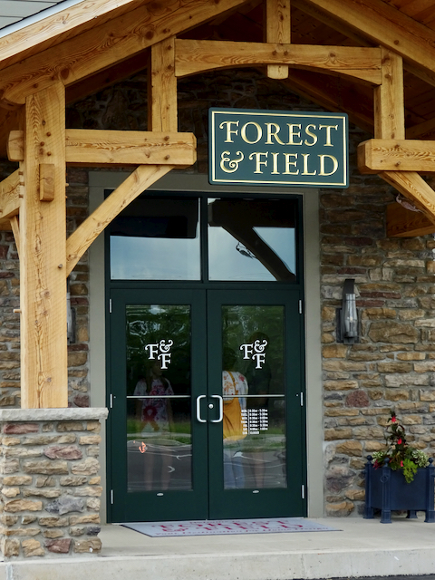
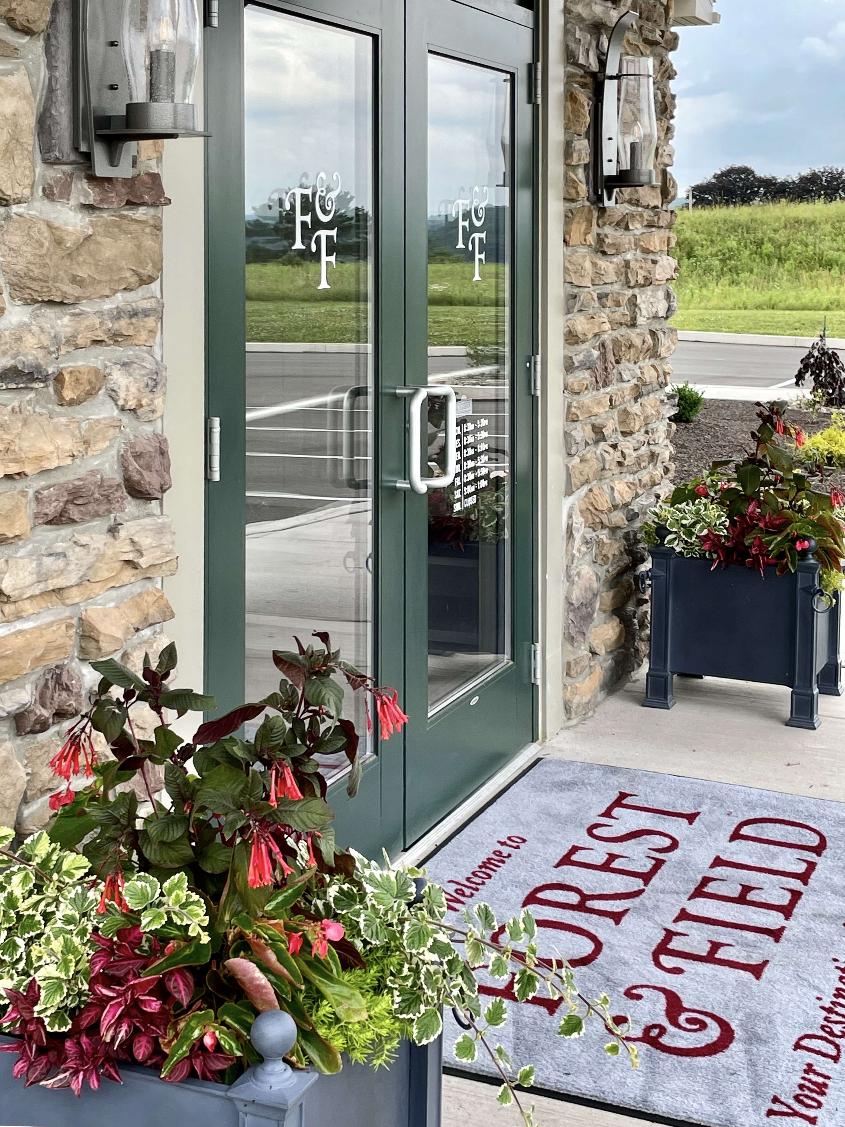

The showroom’s branding came together well, with the green and gold, solid cedar main entrance sign hung on the custom-made portico, and the abbreviated logo on the doors. I also designed an exterior entrance mat, and a larger one just inside, welcoming visitors to mudroom displays before opening up into the expansive space.
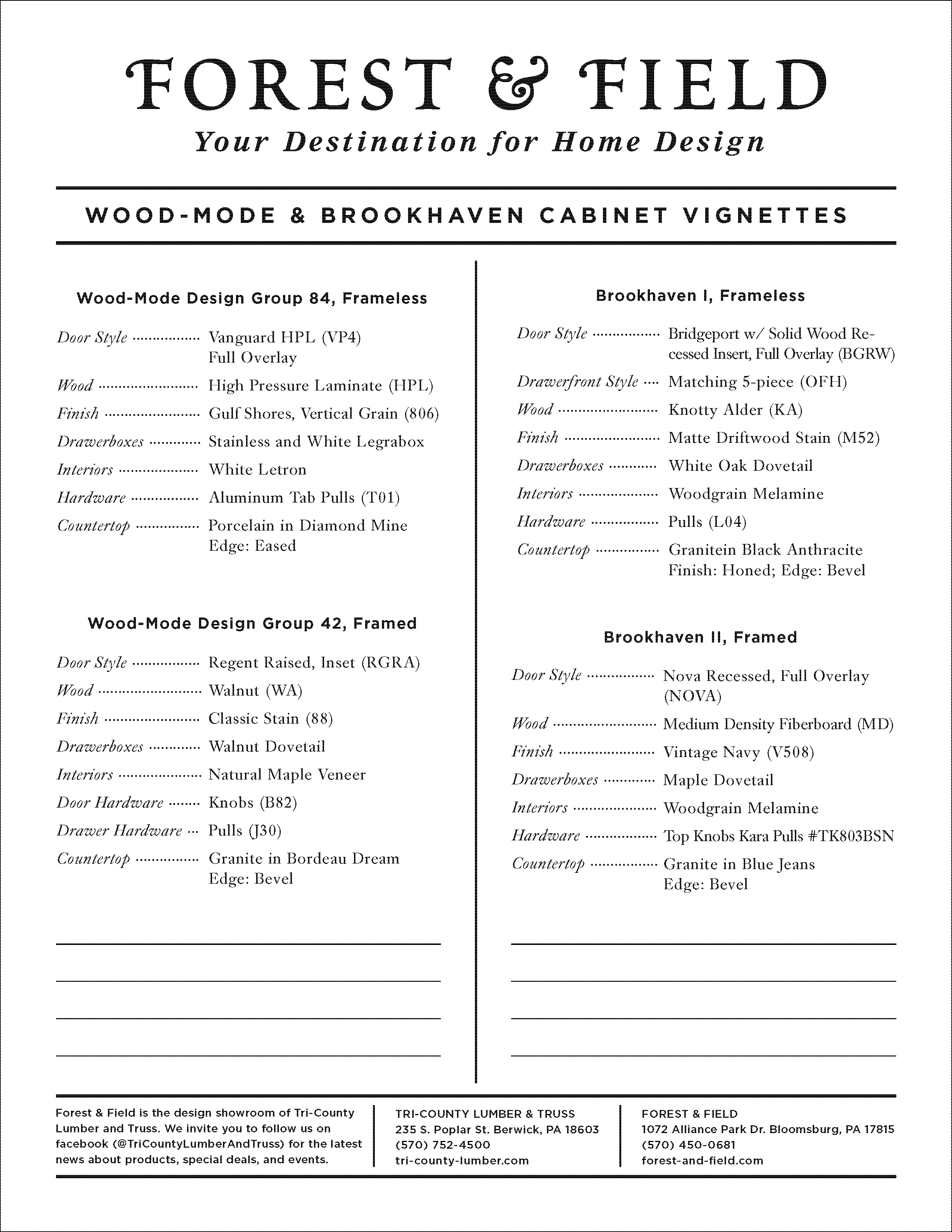
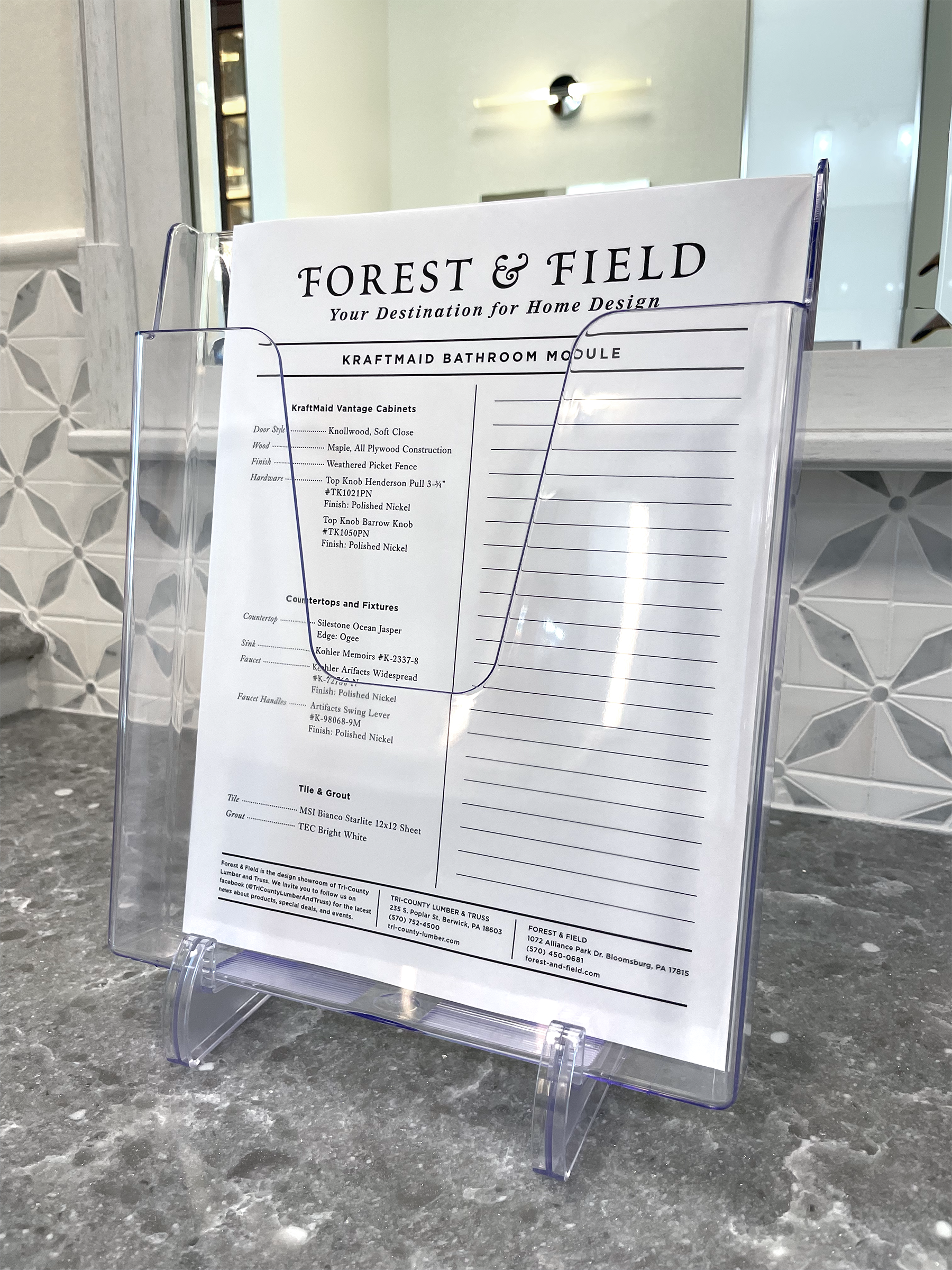
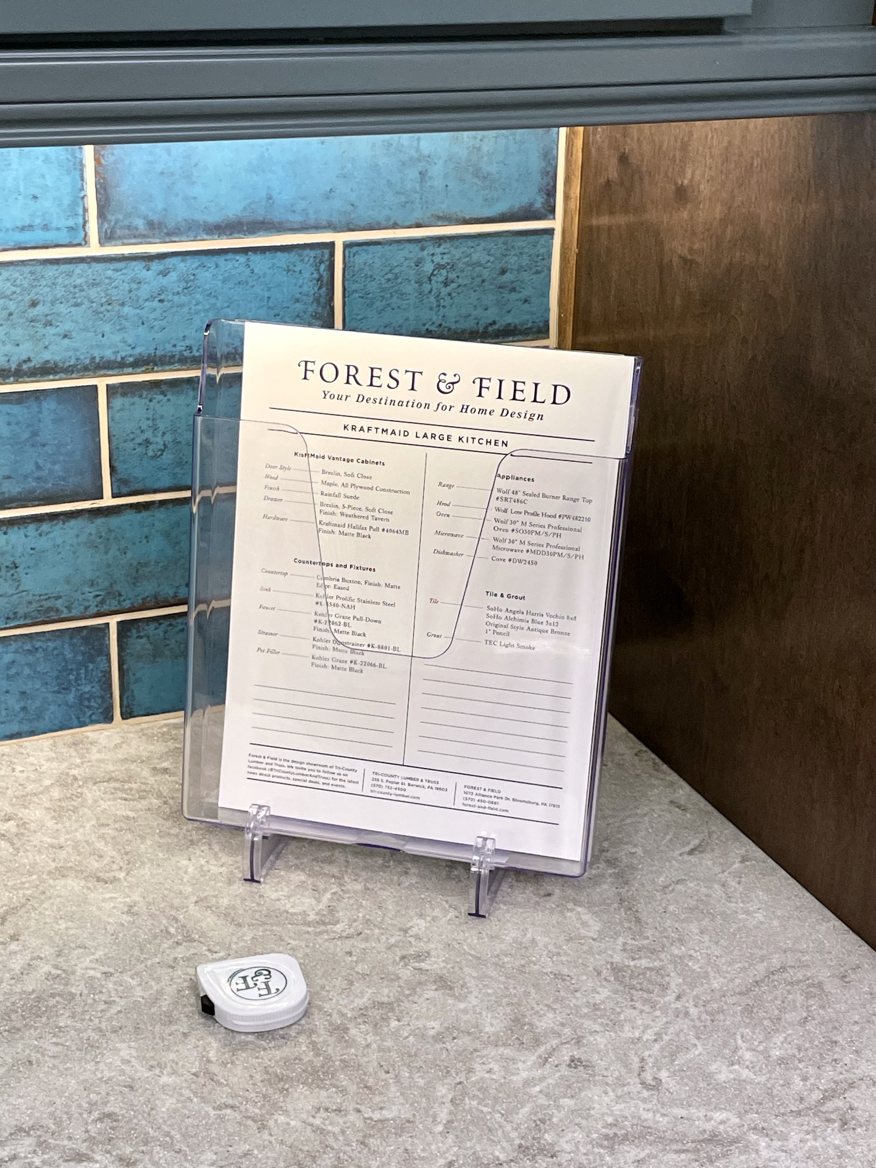
I was asked to develop signage for the numerous displays in the showroom. Instead, I pitched the idea of creating handouts for each station containing all the elements of the display along with room for notes.
This proved highly popular with customers, and I also designed a branded folder they could use to keep notes and other materials organized.
I then designed diagrams to simplify the overwhelming cabinet, countertop and sink choices clients need to make, and added free promotional tape measurers for them to take home.
This all made for happy customers and reinforced the brand.
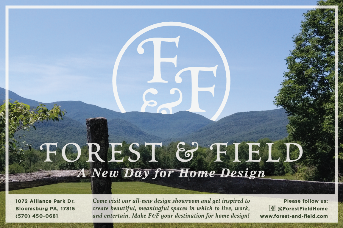
We introduced the newly opened showroom with an ad placement in the newspaper featuring a treatment of the logo as if it was a sun rising beyond the distant hills, complemented by the new slogan, “A New Day for Home Design.” I also used this motif for the home page of the website — the Northeast PA landscape was the inspiration for the business name, so we ran with it.
EXTENSION INTO NEW MEDIA
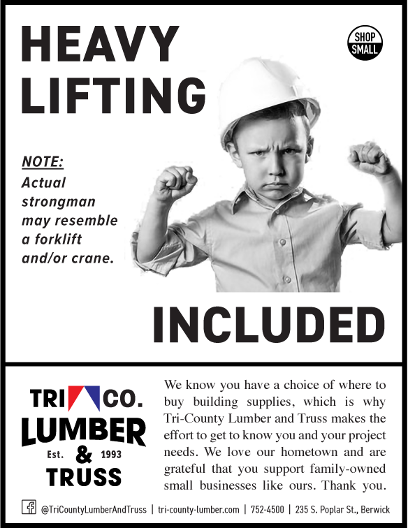


With the showroom now open, I turned to communicating the lumberyard’s core business — lumber — with some humorous ads and hometown pride. The lumberyard also continued to sponsor local events and groups, and stood out for it with the new logo.
The showroom added local TV and radio advertising to get the word out, for which I wrote scripts and provided art direction.
We were also able to save money on print advertising by utilizing the same ad sizes used for one business in the past, but splitting it into side-by-side ads. This was only possible with the new, more compact and flexible branding.
We were also able to save money on print advertising by utilizing the same ad sizes used for one business in the past, but splitting it into side-by-side ads. This was only possible with the new, more compact and flexible branding.
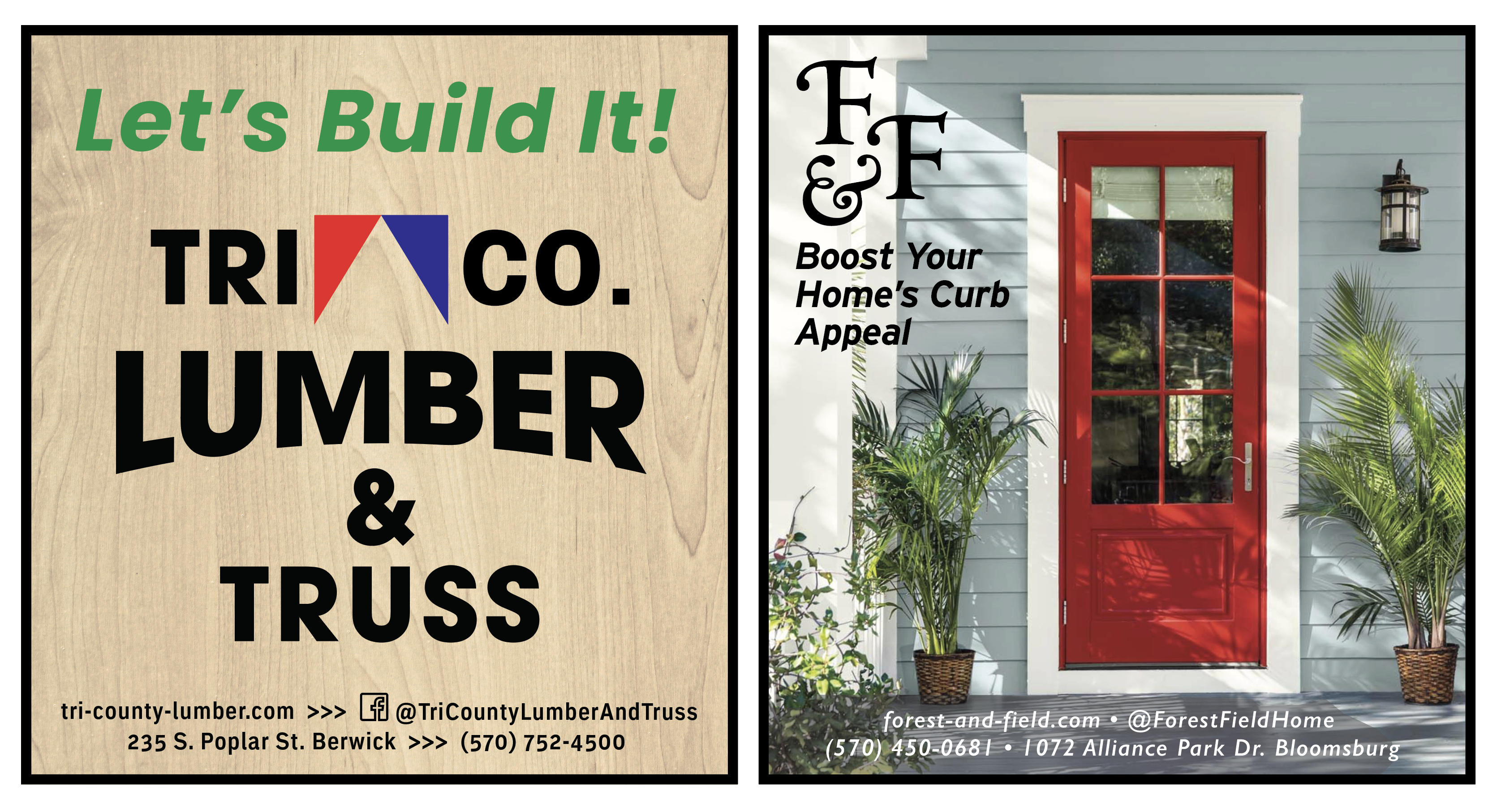
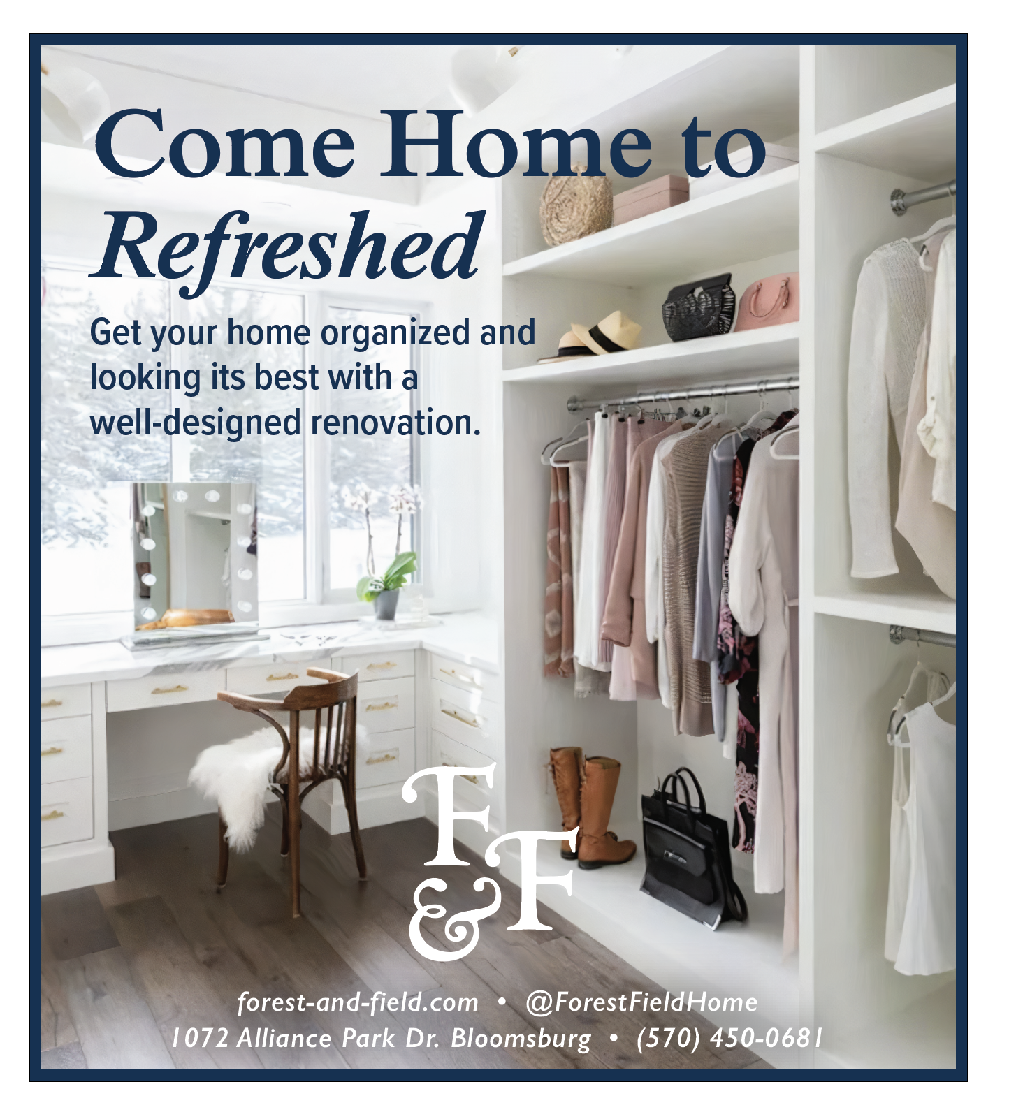
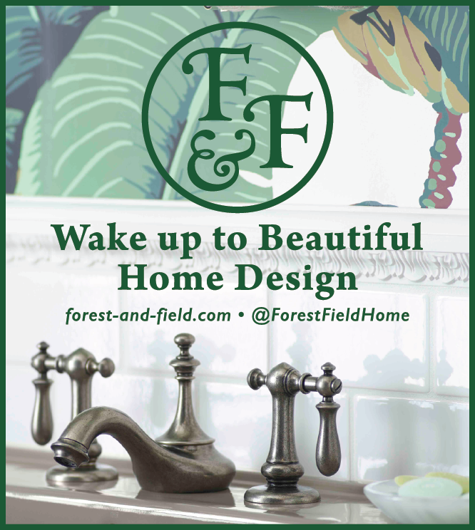
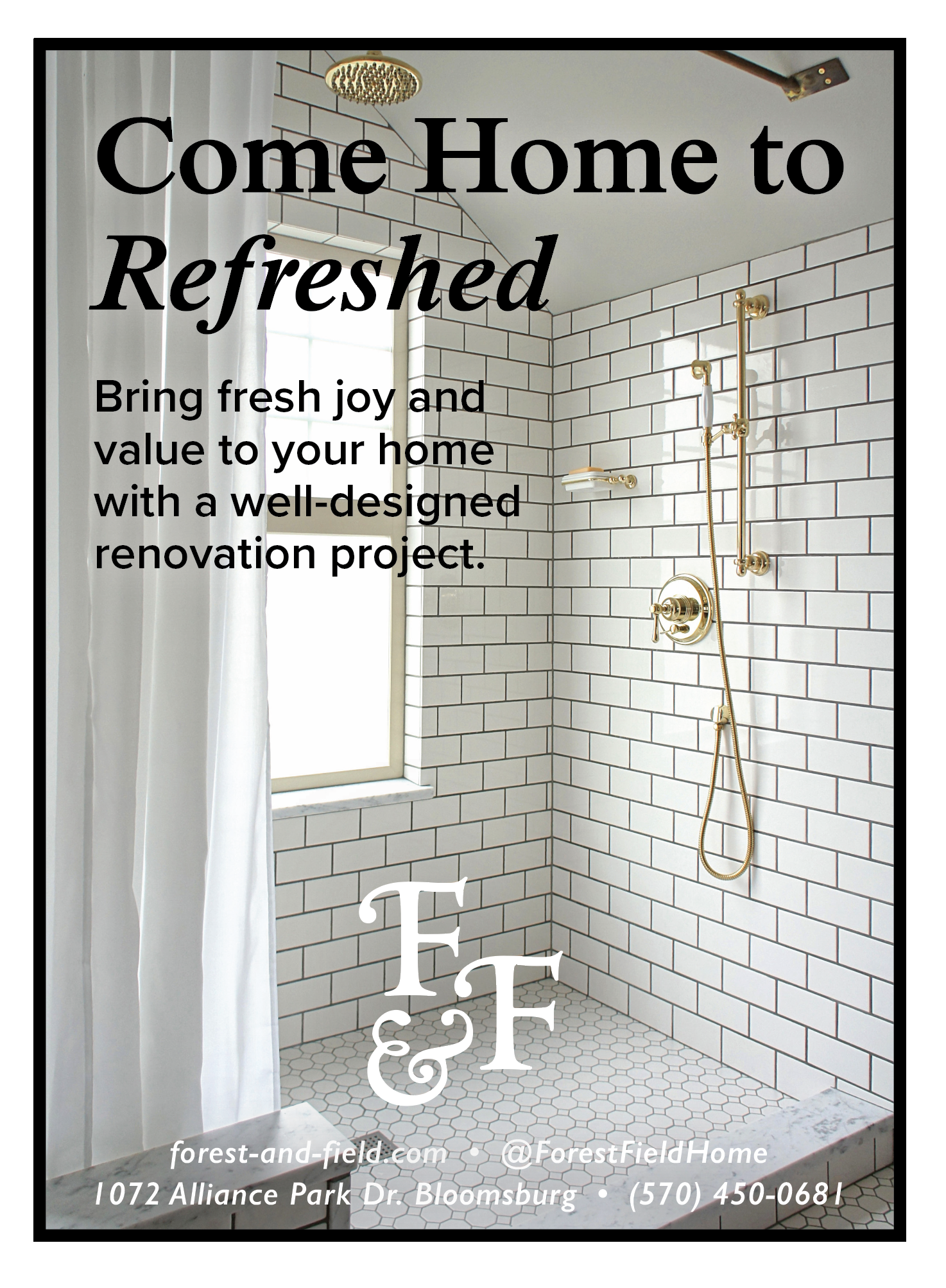
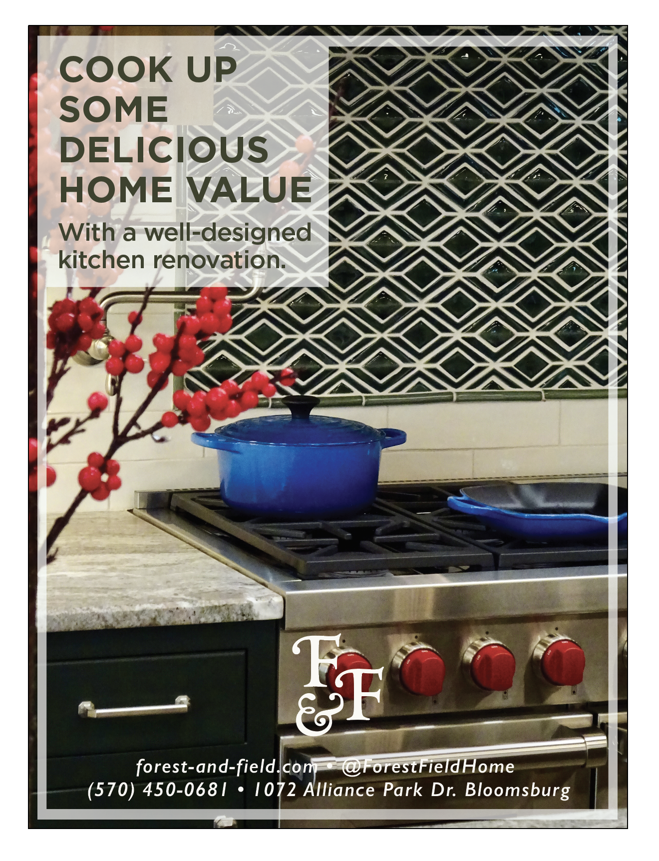
I continued to create an array of ads promoting the showroom’s services and products through print, TV, radio, and social media. The aim is to reinforce the brand identity and educate the community on why design matters, all in context with the current economy, which at this point was favoring renovation rather than resale.
RECENT EXPLORATIONS

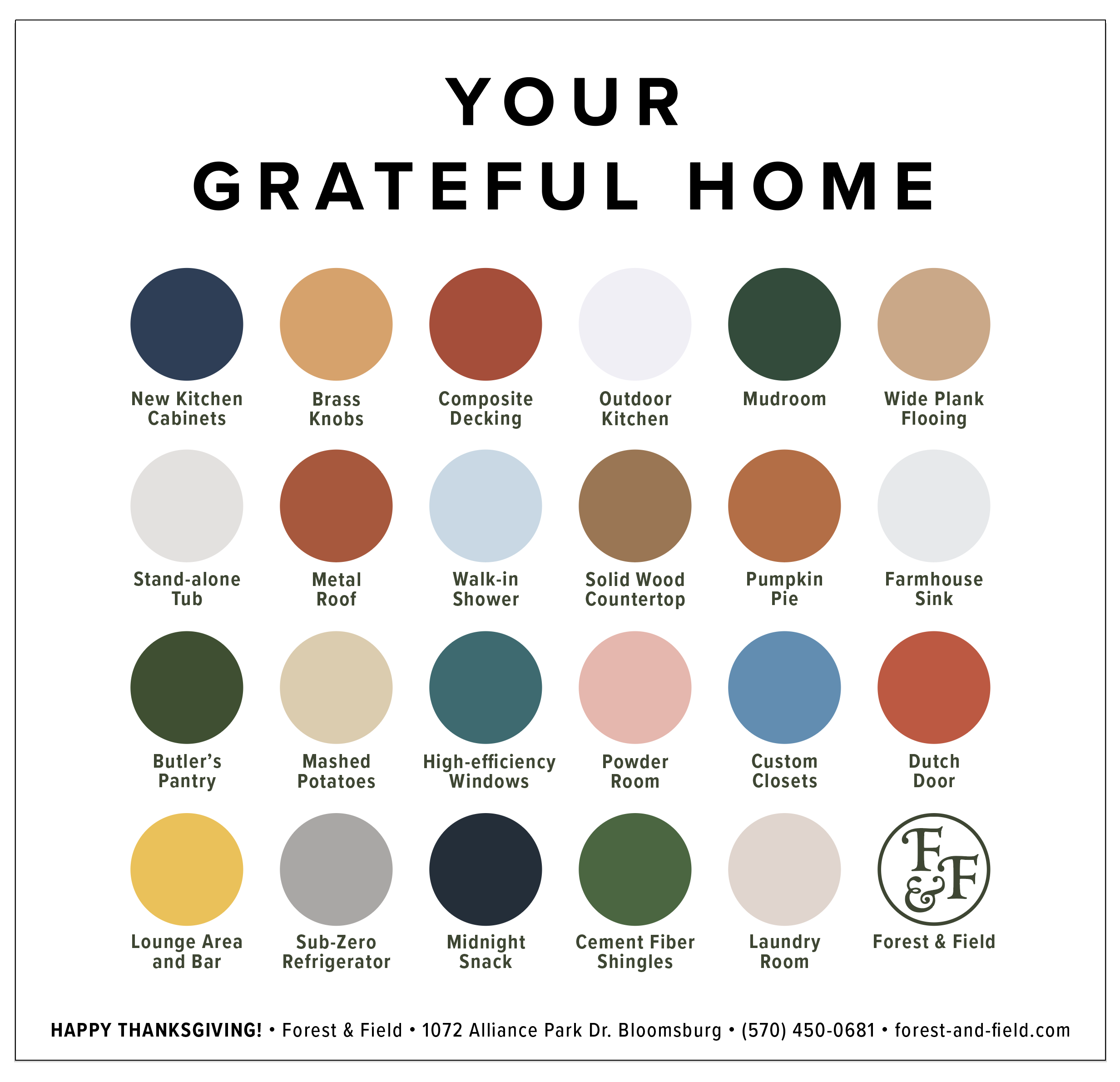
Recently, I have experimented with advertising concepts that don’t use photos. As mentioned before, newspaper ad spaces are often crowded and busy, making even the most attractive photos difficult to stand out.
What resulted was a grid/tile concept that has been proven highly adaptable, with versions used in newspaper ads, the phone book, online, and even at golf events. It grabs attention, informs the observer, and reinforces the brand.
Finally, the “Your Grateful Home” concept was a fun ad for a special Thanksgiving magazine of the local newspaper that received great feedback. I’m currently working on a version as a poster.